Beyond the Galleries: How Navigating Museums Is Its Own Art Form

A look into map design and how it can significantly change visitor experience.

Nothing excites me more than visiting a new museum. They’re probably the most interesting government-funded buildings to exist!

The excitement of browsing through collections online, gearing up to go see favourite pieces or learn about new stories has always piqued my interest. Every new city I visit includes a trip to at least one museum, and I always pick up a map as a souvenir. Over time, I’ve started to compare the maps, and have begun to realize it is an overlooked factor when it comes to presenting these museums to the public.

It’s a pretty small feature to get worked up about, but it’s an important facet: they guide people and help make sure they don’t get lost, that they can see as much as possible before leaving. I don’t believe museums go out of their way to make sure you don’t get through everything because most tourists won’t be back a second time. I do believe the design of a museum map matters, and that sometimes it feels like certain museums go out of their way to make these maps inaccessible.

It irks me when a map is hard to decipher—it’s not difficult to make clearly labelled floor plans. Some museums create their maps to look like treasure maps; if you stumble upon the room you were looking for you’re considered lucky. You totally won’t feel like you’ve been wasting time trying to figure it out. Luckily, most museums are not places where you’d necessarily need a map, but when you’re on a time crunch or want to see specific rooms, it really helps to have something legibile on hand. Plus, many visitors who have accessibility needs would likely benefit from a well-designed map as well.

The Royal Ontario Museum is my favourite simply because each room is clearly labelled, and it doesn’t try to hard to look uber fancy. The galleries are labelled with a general theme and in big bold letters. I will admit that the floor plans are a lot simpler than other museums’ and I’ve been there so many times I know the place like the back of my hand. Still, it’s easy to get lost if you’re trying to use any of the shortcuts. I helped a couple of older ladies to get to another room, and though I knew the route wasn’t complicated, I felt they were still confused. It helps that the ROM has a simple floor plan, otherwise I’d know my help was useless.

Another thing about many museums is that you can’t rely on signs within the museum simply because…they don’t exist! So if the museum is already flawed in this way, why is it so hard to create and offer good maps?

I remember going to the Houston Fine Arts Museum recently. Absolutely love that place, they’ve got a great selection, the curators did an excellent job etc. etc. However, I was constantly stressed out. You see, unlike the ROM, HFA had an awkward vertical map. The floors were practically miniaturized with labels that were shrunken even more. Even worse, HFA had 3 seperate buildings to visit, so trying to figure out which building and gallery I was visiting was a disaster. Every time I tried to match a gallery to the room on the map I spent extra time that was essentially being wasted. The galleries weren’t labelled by what the theme was, unlike the ROM.

Another thing to note: the price of maps. They should be free.

Washington D.C. is a great place because its museums are free (hooray!). You’ll rarely find top-tier museums with free admission. However, I found it absurd that the staff was offering maps with a huge “$1” sign next to them. The staff said they were encouraging donations, but their sign didn’t say that in huge letters. I thought that was a bit scummy. I’m all for saving paper, but most people are going to want a printed map, so it comes across as a cash grab. I don’t recall coming across any signs of digital map availability which annoys me even more.

Maybe I would’ve donated considering the place was free, but the sign should’ve had a “pay-what-you-wish” setup, which is what the Phoenix Art Museum offers on Wednesdays.

Design elements are important because as a visitor you can get more done in less time, and tourists are often busy trying to visit multiple places each day. The Prado Museum in Madrid does a great job of “less is more” by using colour coding, an element that is not used enough! The galleries are shown in a flat 2D format, but the rooms are coloured and match a given legend. It’s easy to read and figure out where to go. It was also free. Andrew McIlwraith wrote a thesis that focuses on the study of museum map design and its effectiveness. It mentions that some museums will have different maps at different prices (ranging from free to about a couple of dollars), but I don’t see the point in that either. Museums are public buildings that should be accessible to every type of visitor.

Based on the McIlwraith’s findings, the British Museum was charging 2 GBP (1.4 USD in 2018 which roughly be the same today) . The 2014 map was all black and white, with numbers all over and a legend above to ‘help’. It looks overwhelming and the lack of colour is annoying. This is a common theme with maps though, there are plenty of places that don’t go the extra mile to make maps look accessible.

Some museums try to make use of the digital era by offering advanced maps. For example, the Met Museum uses 3D printing technology to produce special maps for the visually impaired. Many countries across Europe have also begun using this tool thanks to the Ambavis project.

On the other hand, some museums solely choose to go digital, which is…a choice. I remember the National Archaeological Museum in Athens made me connect to the WiFi to look at the map online. However, this museum and many others offer their maps online to download and print which should be a given in this day and age. Athens’ museum is small, and it’s ridiculously easy to walk around. Still, their team made the conscious effort of colour-coding regardless of using a number system.

Personally, I am not a number person and would much rather see a themed title for the gallery so I know what I am looking at. I don’t like looking at the name of the actual room because what is the point? I don’t know this person it’s named after and it gives no indication of what’s in that room, so I almost have no choice but to check. Again, it takes up time for the visitor.

Fortunately, some museums offer apps you can download to view 3D maps and play around with them. It’s not an option that everyone may want (I don’t think I would use them) but at least it exists.

Maps in general are helpful tools in any setting, and its importance is often overlooked by people visiting places like museums. As an avid museum fan who keeps maps after visiting, I’m not only reminded of which ones had which pieces, but of the overall experience. If the architecture of a building is atrocious, the least you could do is make exploring it easier! After all, design and function go hand-in-hand.

Copyright © The Mouth That Writes, 2018-2024. All rights reserved.

Follow me @tannaaz for more.

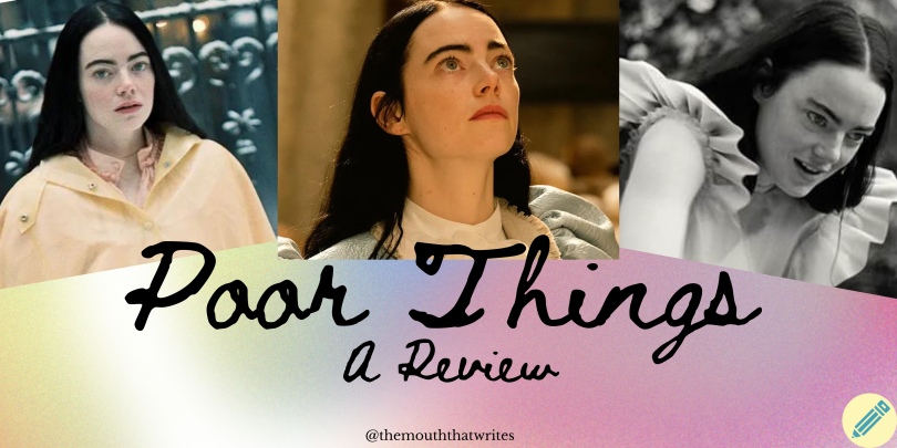
Poor Things: Yorgos Lanthimos is a Surrealist Visionary

Poor You For NOT Watching!

*(Some very mild spoilers ahead)*

I watched Poor Things the night Emma Stone won a Golden Globe for her performance, and it was rightfully deserved. A surreal film from start to finish, director Yorgos Lanthimos spared no minute to shock, humour and spike curiosity in viewers–a difficult task for a runtime of almost two and a half hours.

I will start by saying that this movie is not for everyone for these main reasons: there’s some gore here and there (not very serious), and the fantasy may be too fantastical. A lot of it just doesn’t make sense, and most of it is up for personal interpretation.

Visually, it felt like Dalí was in charge and creating surrealist versions of already existing cities, all warped with the grandeur and realities of the Victorian era (from the perspective of an English person living during that era). The landscapes looked purposefully cartoonish, but the way the characters interacted with the space made it seem normal. Maybe it was an alternate universe. What I enjoyed was the first bit shown in black and white, which makes the environment like a slightly zany and warped version of Victorian England, and once Bella (Emma Stone) is off on her adventure the world is less stuffy and more exuberant. The tonality matches Bella’s emotions, especially comparing the point of feeling trapped to when she’s given freedom.

I also absolutely loved the costumes, especially Bella’s. Many characters, specifically those who connected positively with Bella during her journey, were dressed very fabulously. Even so, Bella’s wardrobe was likely the most detailed and fancy. She popped out against other dull travellers, her lust for life apparent in her colourful and flamboyant clothing choices. Shorts? Big ruffles? You name it, Bella probably wore it. And might I add that Stone rocks darker hair, it was a nice change from the usual red!

The story itself is controversial. By the end, Bella is a sexually liberated woman, though she technically still lives with the brain of a child. However, the audience has little tangible information on how much her brain had developed when she ran off with Duncan (Mark Ruffalo). Their world is erratic and whimsical, so I wouldn’t be surprised if time was a nonsensical concept.

On Letterboxd, plenty of users compared Poor Things to Barbie. I can see why—simply put, it’s about a young woman on an adventure, trying to learn what it means to enjoy life, to find her place in the world and overcome societal barriers. In this film, one of the biggest barriers is “polite society”, a topic brought up over and over again. It’s up to Bella to decide whether she wants to follow its rules or create her own version of it. I was also reminded of Penelope, a 2000s rom-com about a girl trapped in her house for having a pig nose and not experiencing the outside world until she meets a mysterious man. And now I’m also reminded of Rapunzel. It all ties together because Poor Things can be considered a rom-com. And again, the humour is not for everyone because there’s a lot of satirical jokes and subtle humour that may go over people’s heads.

Her adventurous nature gets in the way, but it ends up helping her navigate relationships and her personal goals. Barbie exemplifies a less mature version of this idea (no wonder, because Barbie is a children’s character). She also has to deal with obstacles placed upon women, her’s being the patriarchy (and a simpler construction at that).

The casting was amazing in general. I was happy to see some seasoned actors like Emma Stone and Willem Dafoe, and some newer faces like Ramy Youssef and Jerrod Carmichael (new as in I’ve not seen them before or their filmography is limited). Like many others have noted, Ruffalo’s performance was memorable, rather annoyingly charming in an insufferable way. Each time he whined I wondered why he wouldn’t just leave, but then if he did I wouldn’t get to laugh at his whiny and uncalled-for perseverance.

The one thing that threw me off with the main cast was the accents. Stone’s was fine, but I couldn’t tell if the rest were being serious or if they were in on a joke. I tried to justify not being able to confirm their origins with the fact that nothing else in this movie made sense (like brain switching!? The most obvious “WHAT!?”), but it was almost impossible. Though it didn’t really matter where anyone was from, it was just jarring listening to Ruffalo talk (and whine) with a strange foreign twang (almost like an American impersonating a Brit? Or maybe it was a bad transatlantic accent? Who knows!) Dafoe was maybe Scottish who turned Irish sometimes? Same ordeal with Youssef’s character, Max. The random French tossed in while Bella was in France was also a bit much, but I guess necessary for the situation she was in.

Other aspects to note were the soundtrack and cinematography. The music was perfectly off-putting and still playful. The use of different lenses was so fun, and I enjoyed all times the camera would suddenly zoom in. This movie was able to capture my attention very easily and the amount of effort was easy to notice.

Not every film is meant to be seen on the big screen, but this is something that should be watched in theatres to fully enjoy and be immersed in Bella’s world. It’s atypical in the best way and it should for sure be considered one of the most highly-regarded films of 2023.

Rating: 4.5 out of 5.

Copyright © The Mouth That Writes, 2018-2024. All rights reserved.

Follow me @tannaaz for more.

My Spotify Wrapped for 2023

For reasons unknown to me, Spotify releases Wrapped in November, which doesn’t make sense. I’m going to list the info here, so that it can be compared to previous posts that discussed my music and any observations based on consistent themes/genres/artists etc.

Top Artists:

BROCKHAMPTON

    (most listened during March)

    THE WEEKND

    (most listened during February)

    LORD HURON

    (most listened during April)

    100 GECS

    (most listened during April)

    CHARLI XCX

    (most listened during April)

    I’m not entirely sure what was going on in April because 3/5 of my top artists were listened to then. I remember I had exams? That’s about it.

    Top Songs

    1. “Silk and Cologne”, EI8HT & Offset

    2. “La Suzi”, Ozuna & Nesi

    3. “ringtone”, 100 gecs

    4. “Chills (LA Hills)”, Tiësto & A Boogie Wit da Hoodie

    5. “tears in the club”, (ft. The Weeknd), fka twigs

    Top Genre:

    Rap

    And those are my basic stats! It was interesting to compare each month I had previously covered to my final and official Wrapped record. I’m hoping to keep BROCKHAMPTON my #1 and keep the streak (I think this is the 2nd year in a row and 4th time overall).

    Since this series was started in May, my observations weren’t entirely accurate. However I do plan to continue this idea for an entire year and see what will happen!!

    Copyright © The Mouth That Writes, 2018-2024. All rights reserved.

    Follow me @tannaaz for more.
    My October and November Music Recap

    These two months will be merged together because Wrapped comes out early for some reason that I still don’t understand.

    October is simple to recap, mostly because I was listening to the same artists, albums, and songs on repeat. Here is a quick list that’s out of order for your pleasure:

    1. Black Eyed Peas
    2. Offset
    3. Kid Cudi
    4. Ameer Vann
    5. 100 gecs

    Normally, I try to listen to a variety, both to discover new music and so that my analytics aren’t completely screwed over by repeated songs. During that month though I guess I couldn’t have cared less!

    Offset’s new album SET IT OFF was GREAT! 9.5/10, I’m only taking .5 off because I didn’t like a couple of songs. It’s a pretty long album, which has its pros and cons, BUT I was able to pick out a few faves during the first listen which is always a good thing! “NIGHT VISION”, “PRINCESS CUT”, and “WORTH IT” were instantly saved. “NIGHT VISIONis so good I got one of my friends who doesn’t listen to modern rap interested and sometimes she asks me to play it when we’re hanging out!

    Ameer Vann, a former member of BROCKHAMPTON, had teased fans that he’d be releasing new music with his former bandmate Merlyn Wood. This was like, a year ago. Thankfully he stuck to his word and released a whole album (about a couple weeks after Merlyn’s “EP”…it had like 2 good songs of the 4? Fans complained a bunch, it’s hard to call that one an EP). Bad news is that the best songs were super short and felt like teasers for songs that didn’t exist. Some of them lacked in creativity and were there as filler, but overall it was decent. My dissatisfaction led to playing the same few songs on repeat.

    Black Eyed Peas: wow they sure make me miss the 2010s even though I hated the 2010s (especially the music). Still, I think their work is timeless and they were a powerhouse! I’ve heard rumours will.i.am will be working with Lady Gaga, but it’s all based on a couple photos of them carrying large folders like they met for a business meeting (at a fancy restaurant, of course). I like some of the group’s recent songs as well, but I think it’s getting repetitive and they need to go back to their roots. Sure, experimenting is fun but there needs to be balance.

    Some songs by B.E.P that I loved listening to include “Rock That Body”, “Alive”, and “Just Can’t Get Enough”. For a couple weeks I was playing “HIT IT”, but mostly as a joke. Saweetie and will.i.am’s verses were respectfully NOT great and could not be taken seriously. It was probably unintentional, but the implications of Saweetie’s section raised some suspicions and eyebrows the more my friends and I listened once our laughter died down (which was picked back up again after our realization).

    I had “ringtone” by 100 gecs and “Enter Galactic” by Kid Cudi on repeat a lot. Didn’t pay much attention to the rest of those albums, though I’ve listened to 1000 gecs pretty regularly before.

    Other songs that I listened to a lot during October/November:

    -“Madonna” by Kevin Abstract (his new album is not my cup of tea in general, but kudos to him for trying something new. And like most albums, this one has a couple good ones that I’ve been listening to a lot).

    -“Fashion Killa” by A$AP Rocky. Didn’t care for the rest of the album, but this song has really satisfying backing vocals.

    -“Obsessed” (Sped Up) by Six Dior. This is Mariah Carey’s famous song but the sped-up version. Normally, I don’t particularly enjoy sped-up songs, but Ms. Carey was able to persuade me. I think it’s also because I like fast-paced music like hyperpop/nightcore and this would borderline fall under this genre.

    Copyright © The Mouth That Writes, 2018-2023. All rights reserved.

    Follow me @tannaaz for more.

    the woman, a poem

    “the woman”, an attempt at horror poetry writing for Halloween.

    ***

    during the noiseless night crows call her name.

    the woman mauls her way out of the depths of earth, grimy and sickly.

    blue fingers adorned with jewelry that wasn’t her’s.

    maggots cling onto the meat dangling off her right hip.

    her wispy hair is a veil she drags across the ground.

    a crow sits on her shoulder and mimics her, the sound of her own voice makes her delirious.

    the sound of her own voice makes her delirious. the sound of her own voice makes her delirious.

    she can’t help but smile, showing all 32 teeth.

    her eyes are like fogged glass. she’s constantly cynical because they’re useless.

    her eyes. and her victims.

    you don’t see any of this though,

    unless she pays you a visit.

    know she’s unfaithful, to you and possibly herself at times,

    because she never learned empathy, it was always about her.

    she knows how desperate you truly feel,

    how you won’t admit that you’ve dreamt of her

    and that you now fear such intimacy.

    so you wonder if these dreams count as intimacy.

    “Can I come with you?”

    the question slips out of your mouth while you sleep.

    yet you don’t know why you ask it.

    she slithers her mouth up against your ear.

    “No. Your soul has to leave first.”

    When anyone pays you the sort of attention you used to crave,

    you feel a strange urge to dimiss them.

    this faint tug in the back of your mind.

    you shun them. they’re not good enough.

    you don’t know if you have it in you to give what they want.

    after many of her visits,

    you see your skin is greying. perhaps it’s fatigue.

    on another day your eyes are bloodshot. perhaps you’re still tired.

    you’re noticing scabs all over the following week.

    but you can’t remember picking your skin.

    one morning, the last morning,

    you look at yourself

    and she’s there too.

    it’s finally time.

    Copyright © The Mouth That Writes, 2018-2023. All rights reserved.

    Follow me @tannaaz for more.